


Visual Storytelling • Brand Identity • Digital Impact
From brand identities to digital campaigns, my graphic design work blends strategic thinking with bold, engaging visuals that bring ideas to life through magazine spreads, covers, posters, and infographics!
Graphic Design
Magazine Spreads
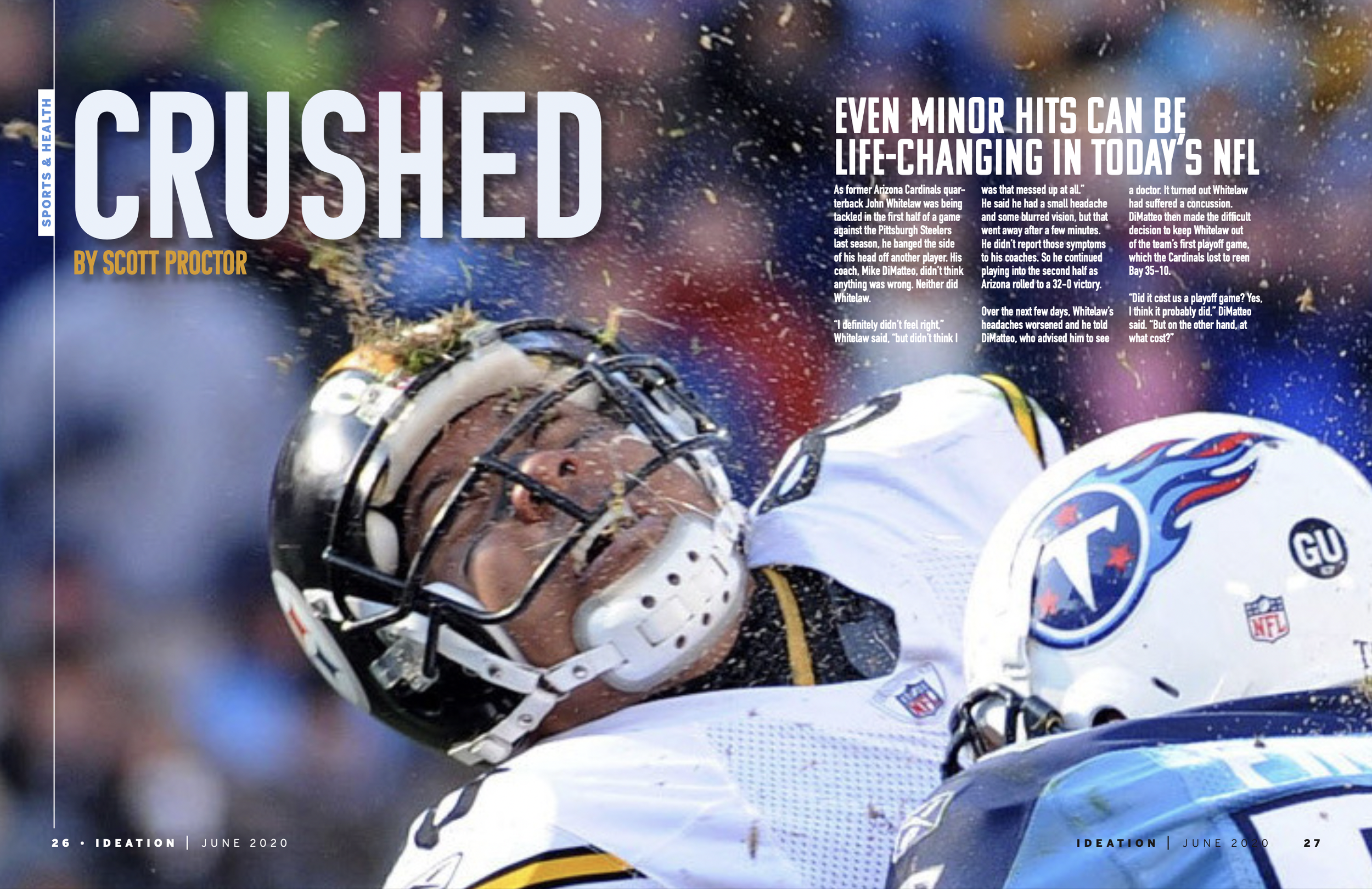
Work done for The Internationalist and Five Dining Monthly, these editorial layouts combine immersive photography, refined type hierarchies, and flexible grid systems to bring long-form storytelling to life. From lifestyle features to food culture, each spread is carefully composed to balance clarity, visual rhythm, and a strong editorial voice.
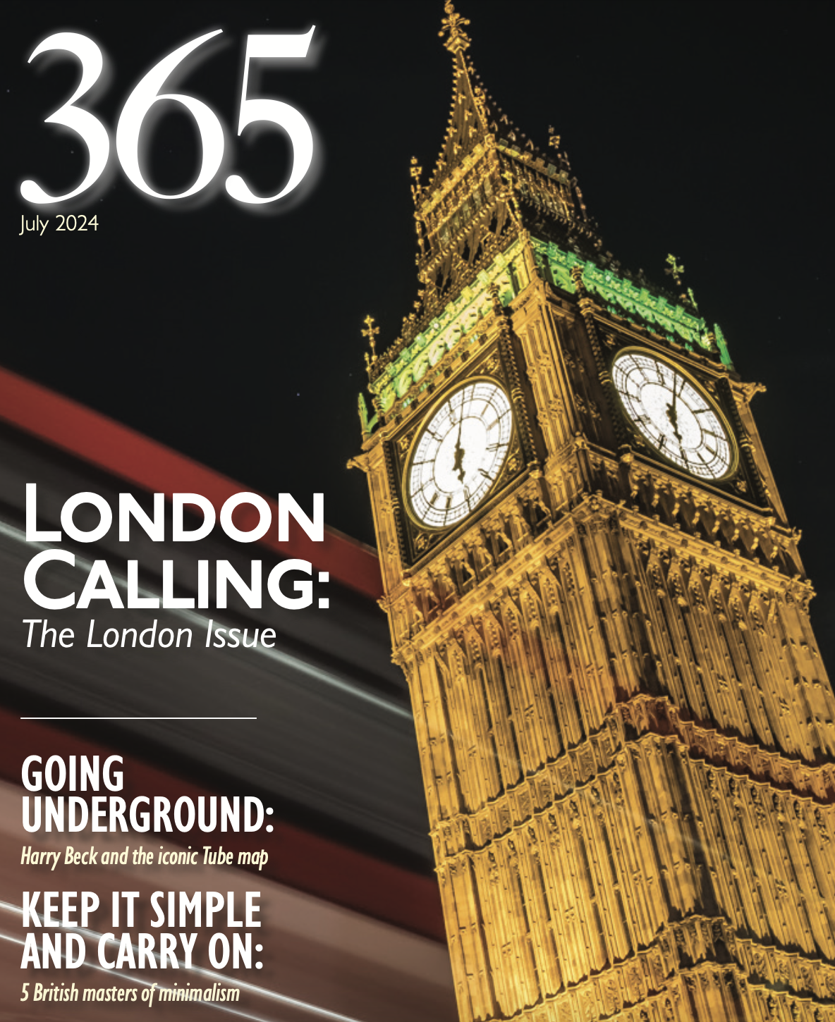


Work done for 365 Magazine, a publication that takes a visual deep dive into the design legacy of London’s iconic Tube map and its minimalist roots. This layout blends bold typography, structured grids, and curated imagery to echo the clarity and impact of Harry Beck’s original vision.

Underground Icons: The Story Behind the Map
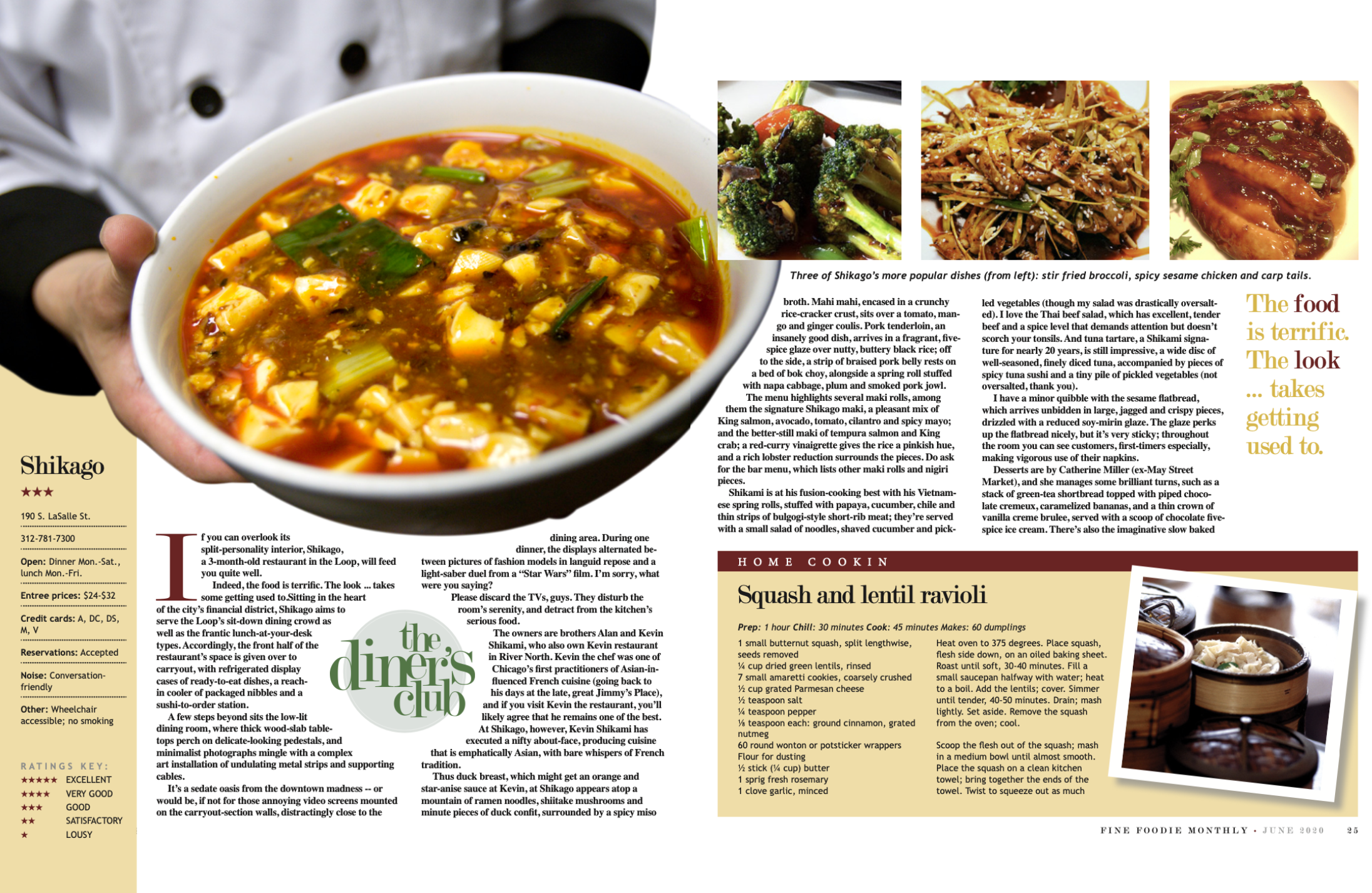
Cool(er) Fusion: Redefining Tradition with a Twist
Work done for Five Dining Monthly, this editorial spread spotlights the Shibakami brothers’ innovative take on modern fusion cuisine. The layout pairs vibrant photography with clean, editorial typography and a modular grid system to highlight texture, movement, and storytelling—capturing both the flavor and finesse of their culinary artistry.
Magazine Covers + Posters

Infographics
-

IU Media School
This infographic was designed in Adobe InDesign with supporting visuals created in Photoshop to ensure a cohesive and clean layout. Through strong typographic hierarchy, intuitive iconography, and consistent use of color, the design guides the viewer clearly through each data point. Bold headings, structured groupings, and a roadmap-style flow bring clarity to complex information while maintaining visual interest.
-

Brewing Innovation: London’s Flat White Economy
This infographic explores the rise of London’s "Flat White Economy," combining data visualization, custom icons, and a cohesive typographic system to illustrate key trends in digital sector growth. Designed using InDesign and Photoshop, the layout uses modular sections, geographic mapping, and bar graphs to break down complex economic data into an engaging visual narrative. The warm color palette and playful gear motifs tie back to the theme of creative innovation driving economic change.
-

Mixed-Use Urban Evolution
This diagram illustrates the development of a mixed-use high-rise, showcasing a layering of residential, commercial, home, and office spaces through color-coded isometric modeling. The accompanying diagrams trace both the site context—including zoning analysis and proximity to transportation—and the development process, from initial site selection to final massing. The visual strategy highlights how different programmatic elements were integrated over time to serve urban needs efficiently while maintaining spatial harmony within a dense city grid.